
Designing an AI-assisted document review experience for enterprise operations
Improving clarity, control, and confidence in document verification workflows.
Company: Vakilsearch (2021–2023)
Work: User research, interaction design, information architecture, high-fidelity UI, and design system
Platforms: Desktop web
Smart-i is an internal document-processing product for finance and operations teams that automates data extraction from invoices. Due to accuracy and compliance requirements, users still needed to verify results manually.
I was the sole UX/UI designer on Smart-i, responsible for user research, information architecture, interaction design, and high-fidelity UI. I partnered closely with product managers, engineers, and the ML team to translate requirements into a scalable and usable experience. Design decisions were regularly reviewed with a UX manager to align on direction and execution.
The goal was to reduce manual document-processing effort while maintaining accuracy and compliance. This required making extracted data easy to review, edit, and trust.
CHALLENGE
The challenge was enabling faster document review without compromising accuracy or compliance, especially when automation produced inconsistent results.

PROCESS
Design Decisions
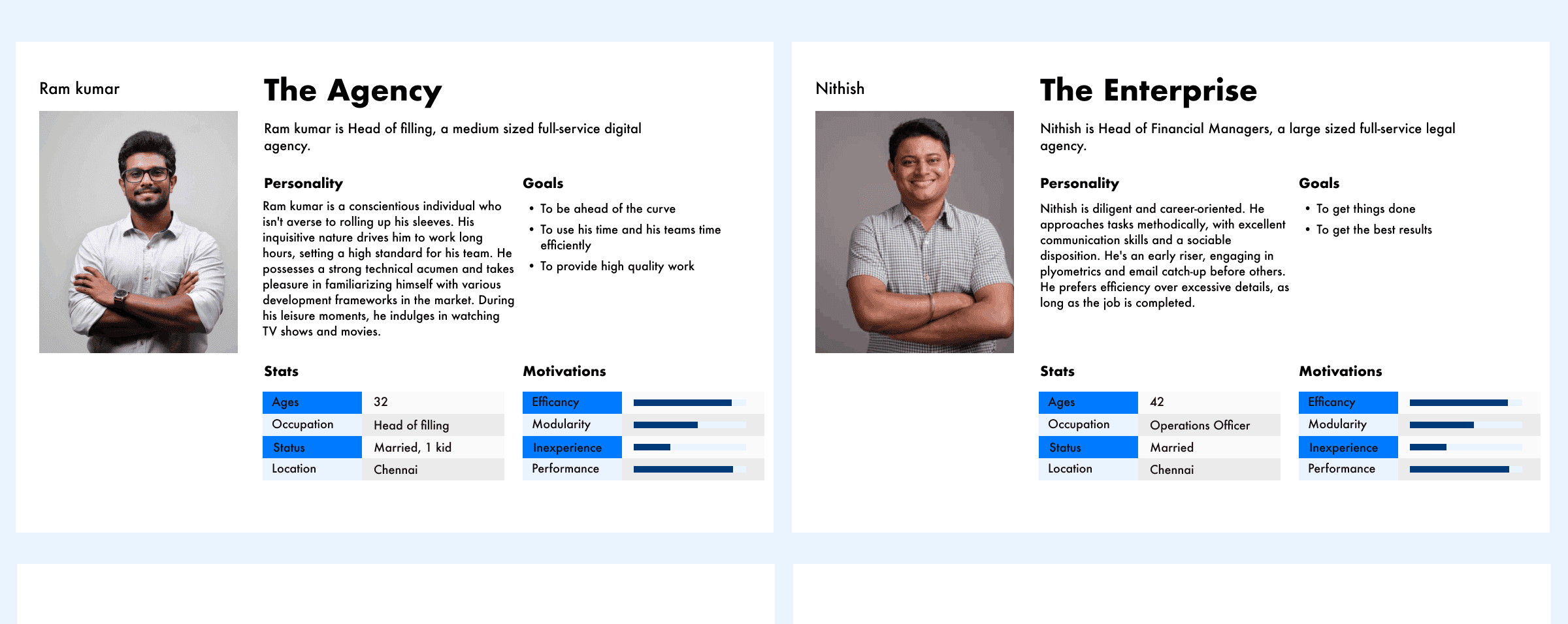
Understanding the Problem Space: The project began by understanding how businesses handled large volumes of documents and where inefficiencies occurred in day-to-day operations. Although automation existed, users still spent significant time verifying extracted data due to accuracy and compliance requirements. The core problem was not extraction itself, but the effort required to validate and correct results before they could be trusted. This shifted the focus from building an AI-powered tool to supporting reliable human decision-making around imperfect automation.
Defining Product Direction: Smarti was positioned as a cloud-based OCR solution focused on extracting structured and semi-structured data from business documents. The intent was to provide enterprises with a centralized system that could support document ingestion, review, and correction workflows across teams, while prioritizing clarity and user control over aggressive automation.
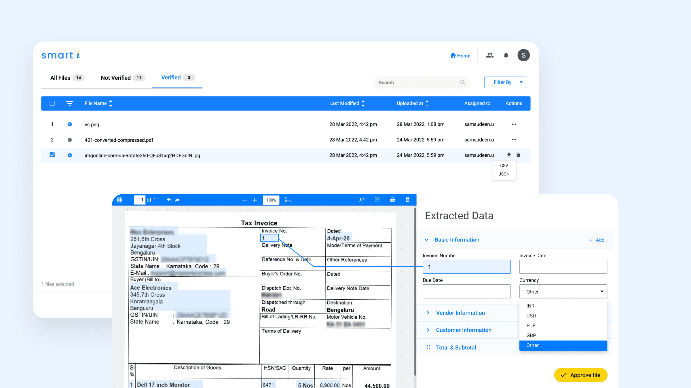
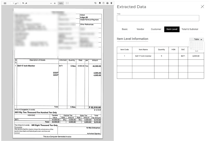
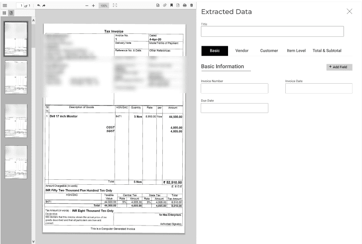
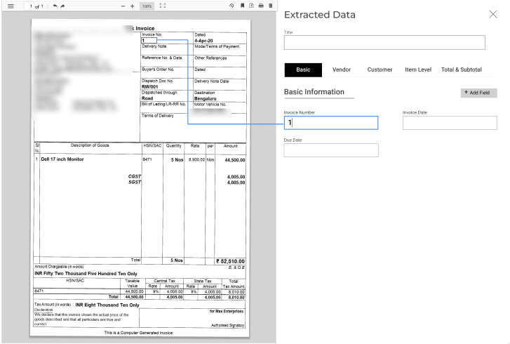
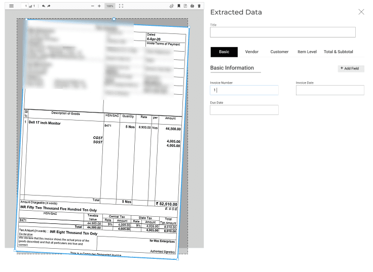
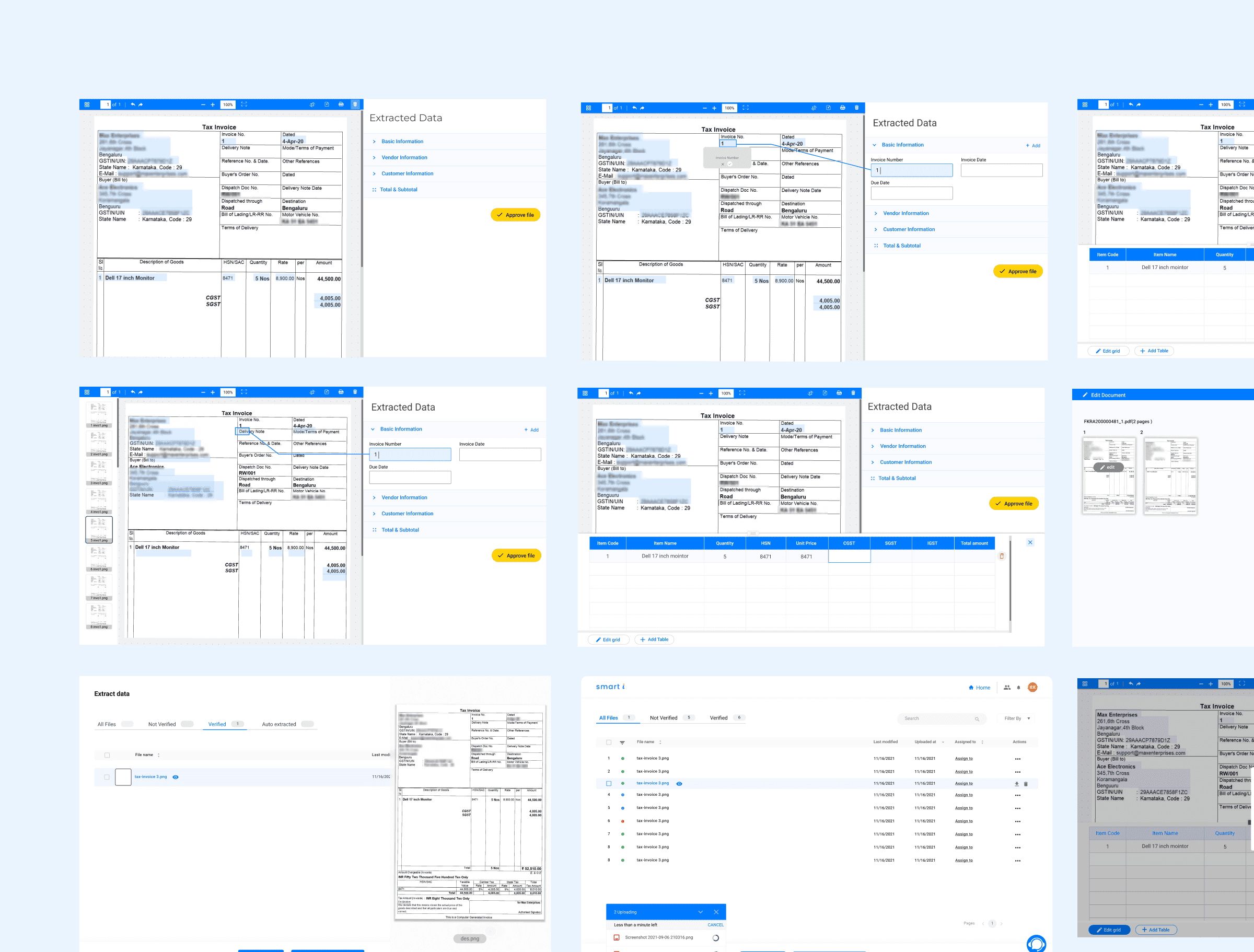
Information Architecture Decisions: Research and workflow observation showed that agents frequently switched between data views to verify extracted values, increasing cognitive load and slowing reviews. The information architecture was designed to reduce this context switching by clearly separating review stages while keeping critical data accessible at all times. The five-tab structure established clear functional boundaries between stages of document review, allowing users to focus on one task at a time without losing orientation and making it easier to return to specific sections during exception handling.
At a macro level, each section focused on a distinct category of information required during document review. This structure allowed users to move through verification tasks systematically rather than scanning dense, all-in-one views, with priority given to the most frequently validated fields.
At a micro level, content within each section was structured to support fast scanning and error detection. Consistent grouping, spacing, and alignment reduced visual noise and helped users quickly compare extracted values with source documents, which was critical for detecting mismatches in high-volume workflows.
Interaction and UI Design: UI decisions were guided by usability, accessibility, and readability. Tabs were placed at the top of the interface to align with common scanning behavior and provide predictable navigation. Extracted data was kept editable at all times, allowing users to correct inaccuracies without disrupting their workflow. Rather than locking fields to speed up completion, the interface prioritized transparency and control to support compliance-driven decision-making.
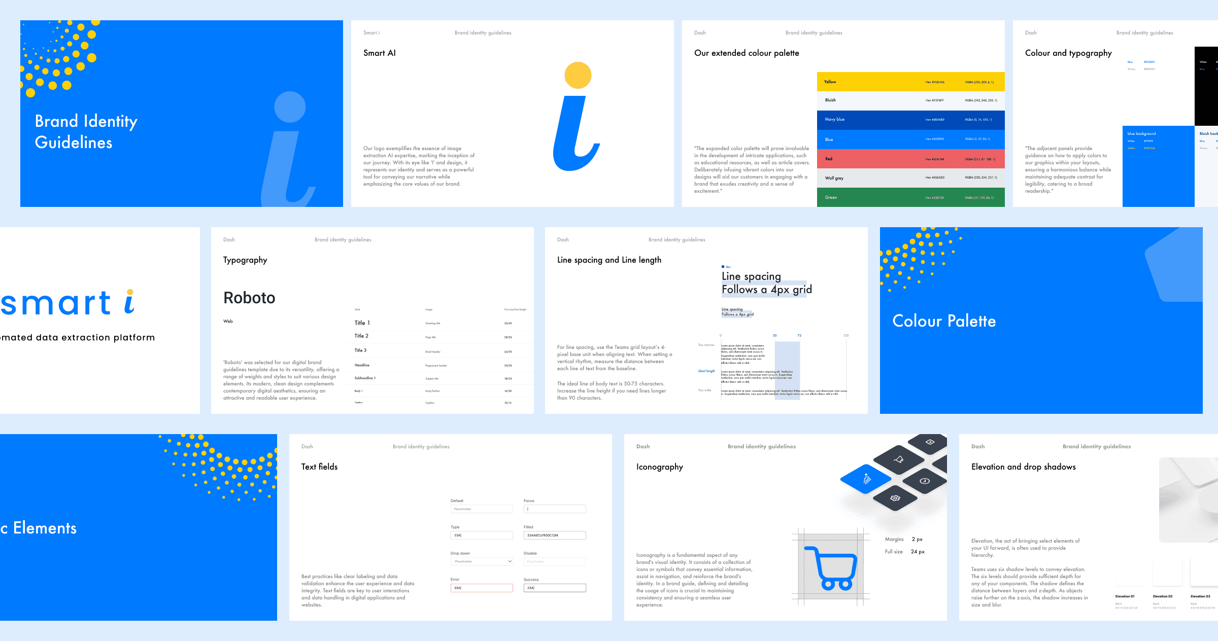
Visual Design Choices: The visual design extended existing brand colors while adapting them for improved legibility and accessibility. Additional colors were introduced selectively to represent system states and document statuses, helping users quickly understand context without overwhelming the interface. Visual consistency was maintained to ensure the product felt professional and reliable.
Prototyping and Collaboration: Design concepts were translated into interactive prototypes through close collaboration with a front-end developer. Prototypes were created for both web and mobile platforms to validate interaction patterns and ensure consistency across devices before development began.
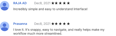
Validation Through User Testing: Feedback collected during the soft launch of both web and mobile applications informed multiple iterations. Usability issues identified during testing were addressed through refinements to layout, interactions, and visual hierarchy. Post-launch, Mixpanel analytics and session/video analysis were used to understand task completion time and repeated actions, guiding further improvements aligned with real operational workflows.

Design System Foundations: As the product evolved, maintaining consistency across multiple sections became inefficient. Modifying elements such as navigation, colors, or typography required updates across individual tabs. To address this, a lightweight design system was created that followed brand guidelines while introducing custom components specific to Smarti’s workflows. This enabled faster iteration, reduced rework, and provided a scalable foundation for future development.
Improvements: The MVP version of Smarti addressed core document-management challenges for internal users, but continuous feedback revealed opportunities for refinement. User feedback and workflow data were analyzed to identify key areas for optimization, leading to improvements in data extraction accuracy, dashboard usability, and workflow automation.
Additional UX refinements—including color-coded document statuses, optimized spacing for better scanability, and typography adjustments for improved readability—were introduced to reduce friction and enhance clarity as the product matured toward broader adoption.
Outcome
As a result, Smarti reduced verification friction by making extracted data easier to scan, validate, and correct in one place. Operations teams were able to complete reviews with greater confidence and fewer escalations, even when automation produced inconsistent results.
Smart i Final Product Design
Related Works

Dash • SAAS product

Libra • SAAS product
Let's talk,
samsusmsu123@gmail.com